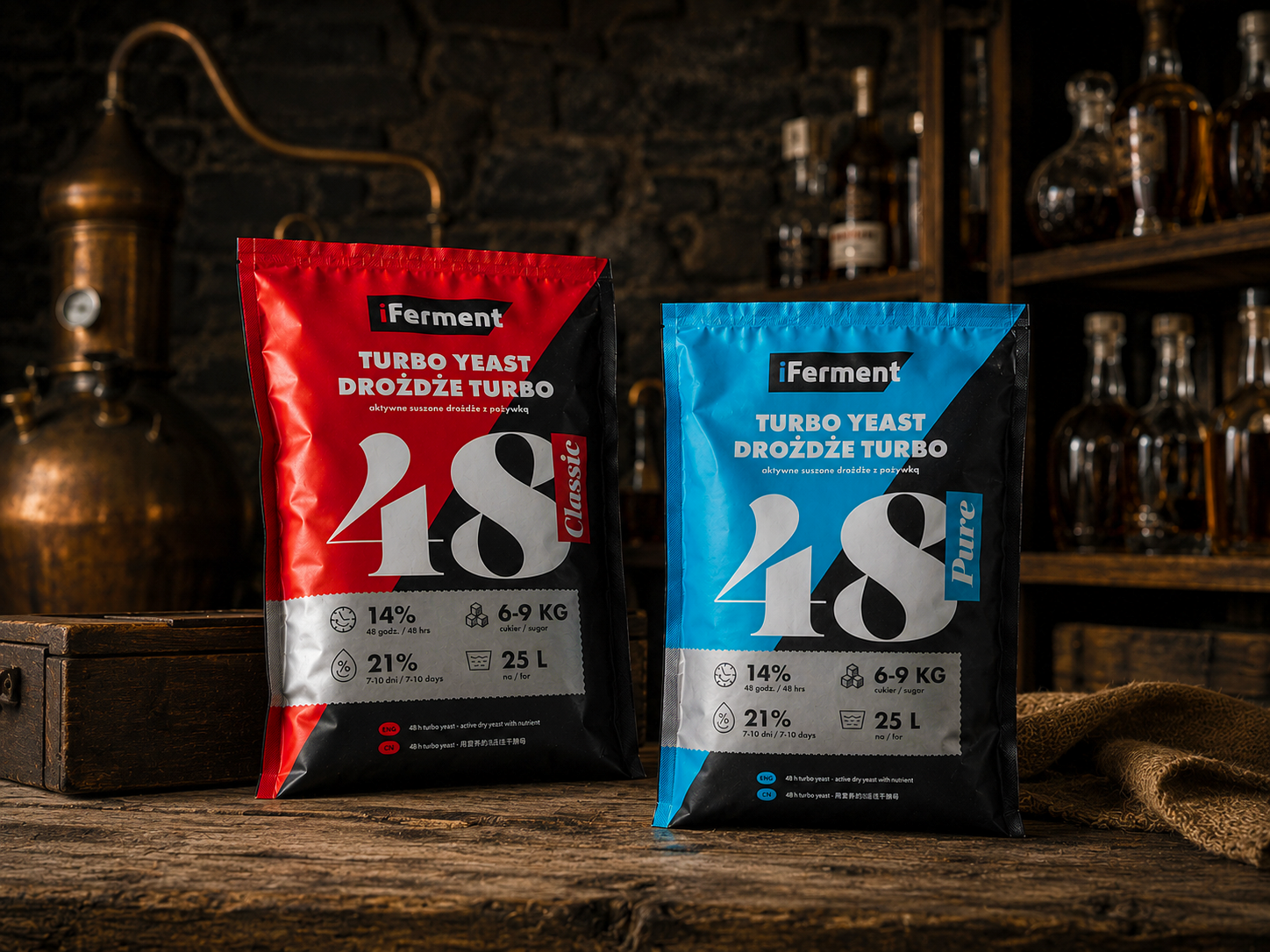
Turbo yeast product line packaging design
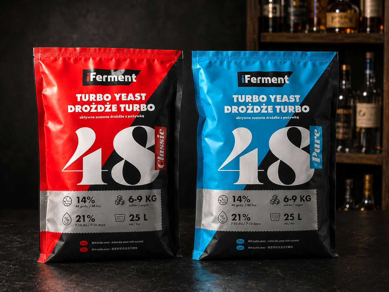
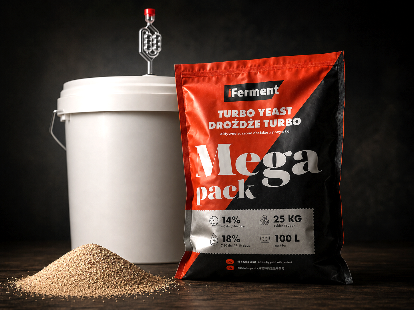
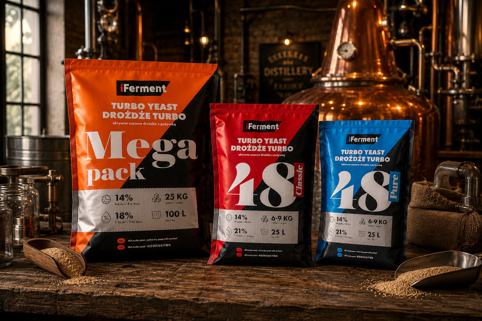
The yeast category has long been dominated by functional, forgettable packaging. The brief for iFerment Turbo Yeast was to break that convention — positioning the brand as a premium, specialist product in a market where most competitors default to generic, utilitarian aesthetics. The result is a design language borrowed from the craft spirits world rather than the homebrew aisle: high contrast, bold editorial typography and a dark structural palette that signals quality before a single spec is read.
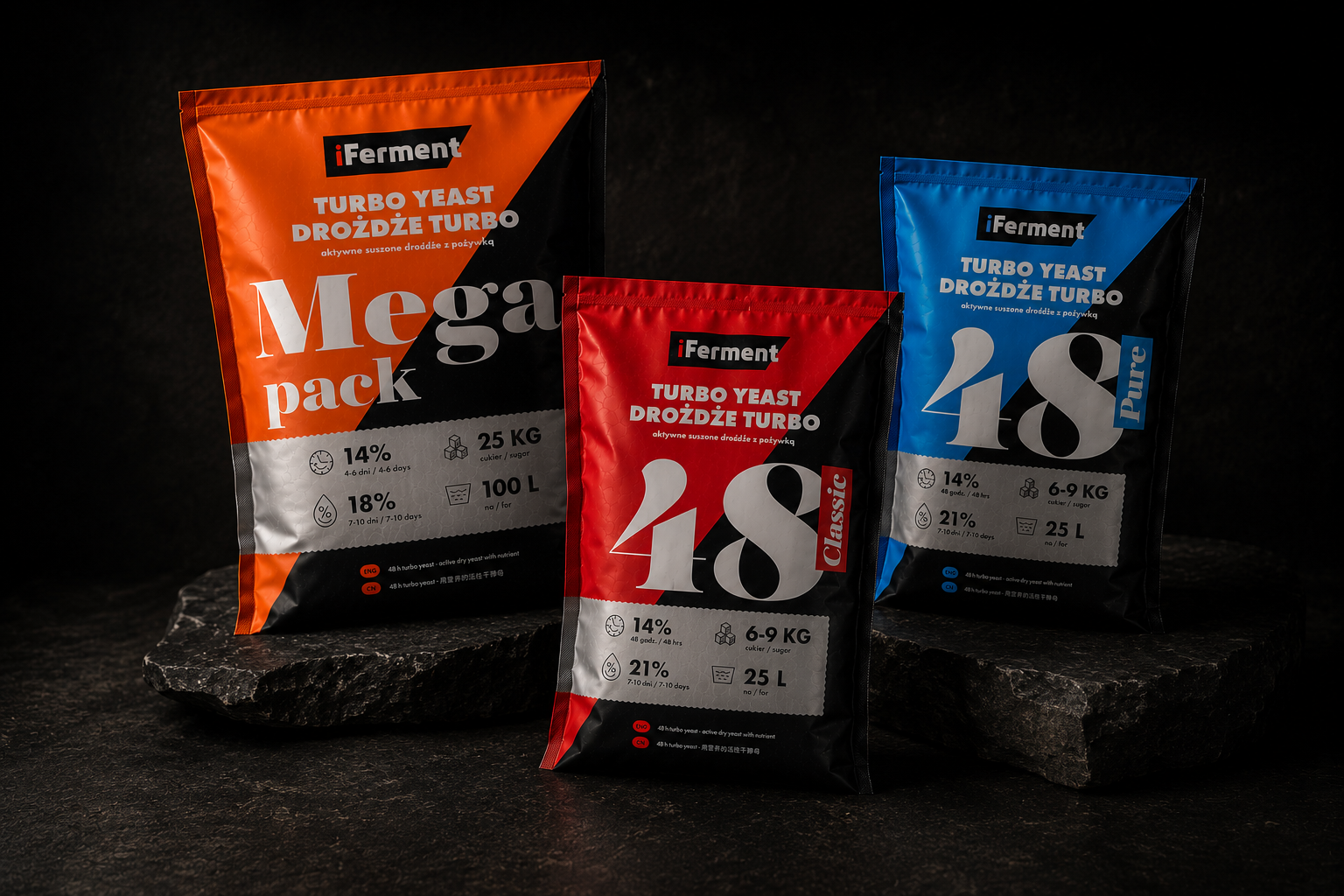
The core design challenge was SKU differentiation within a coherent brand system. Three variants — Classic, Pure and Mega Pack — needed to feel like a family while remaining instantly distinguishable at the point of sale. A colour-coded panel system solves this without fragmenting the brand identity, reducing cognitive load for a buyer who knows exactly what batch size and alcohol yield they need.
The system is fully scalable — new variants, formats or markets slot into the existing framework with minimal redesign, making it a long-term commercial asset that grows with the brand.