RE FRUIT - product line packaging design
MARKET POSITIONING
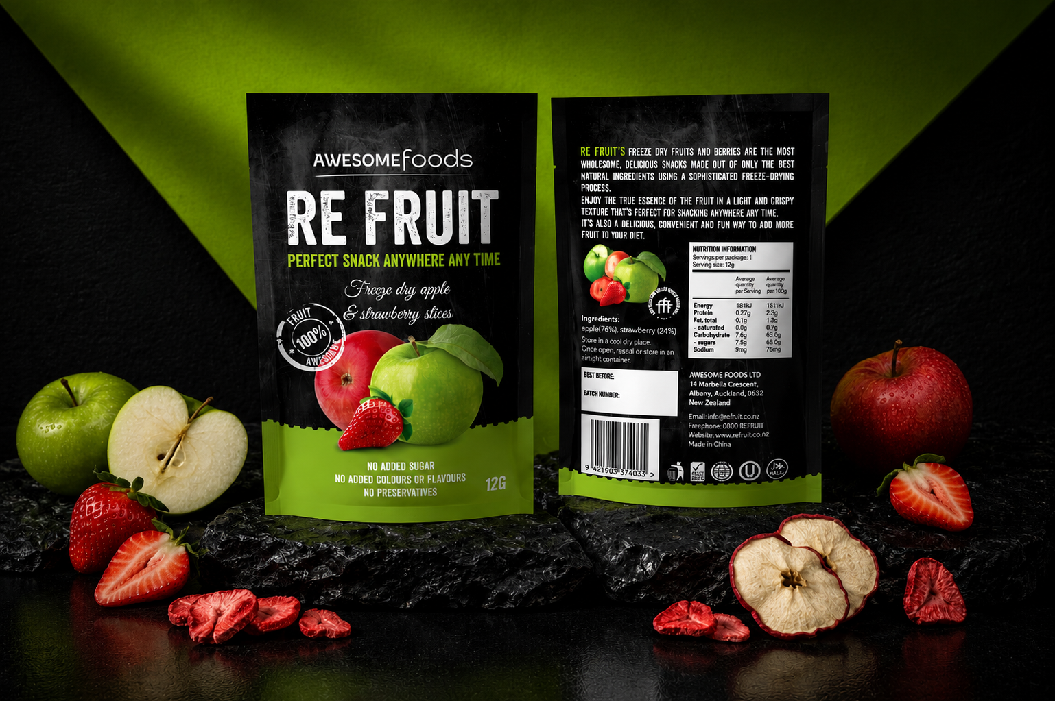
In the rapidly evolving premium snack market in Australia, immediate shelf disruption and premium justification are paramount. For AWESOME foods’ new line RE FRUIT, the design system was engineered to solve the "healthy vs. delicious" paradox, using premium design cues to communicate superior taste and justify a high-end commercial price point.
MAXIMIZING SHELF-BLOCKING VALUE
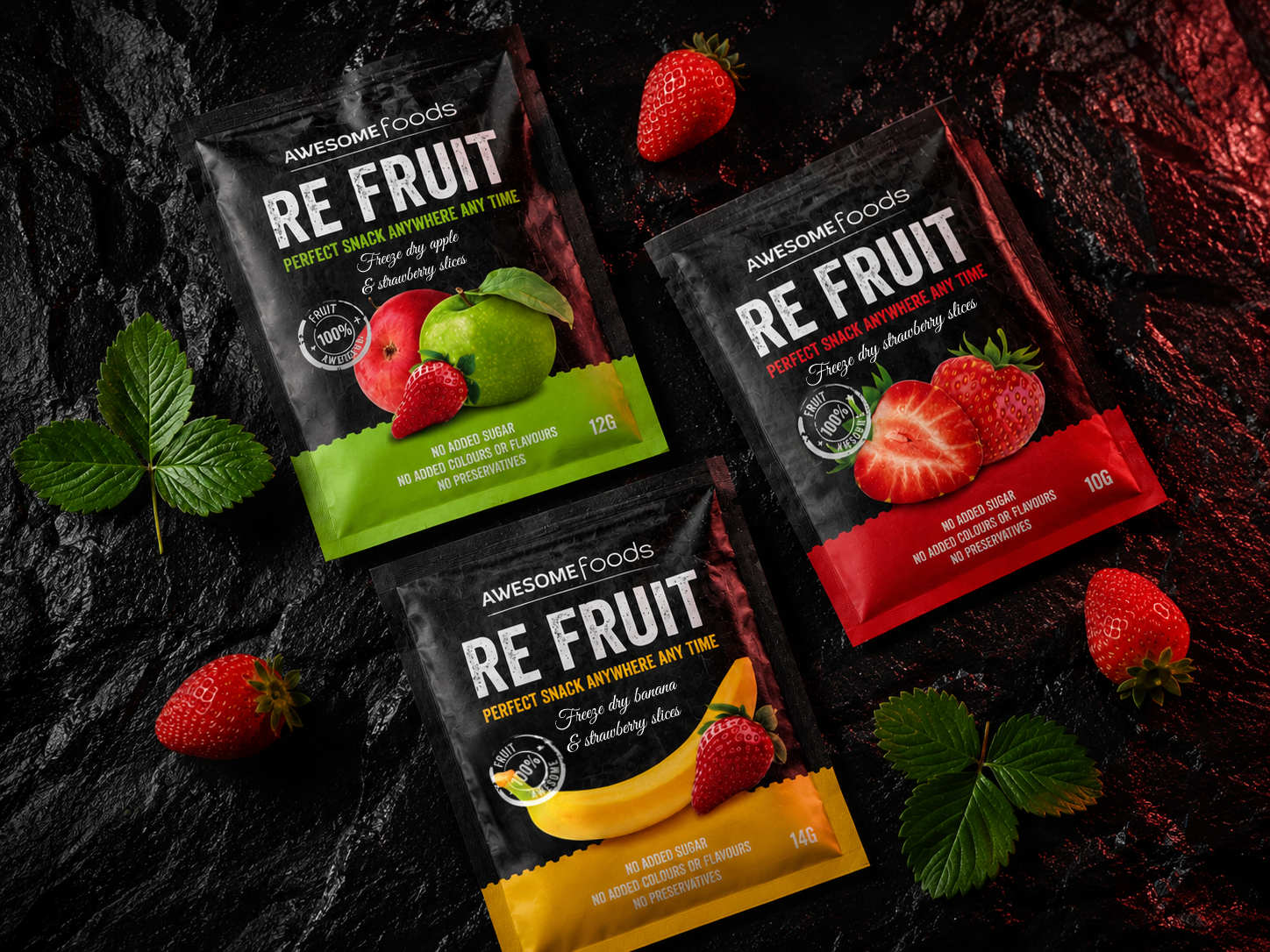
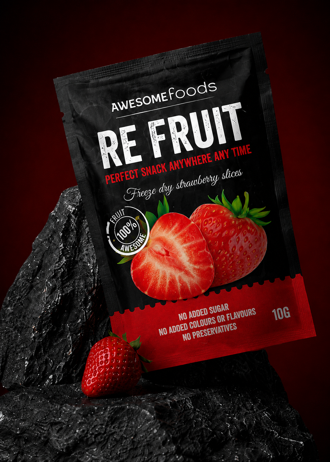
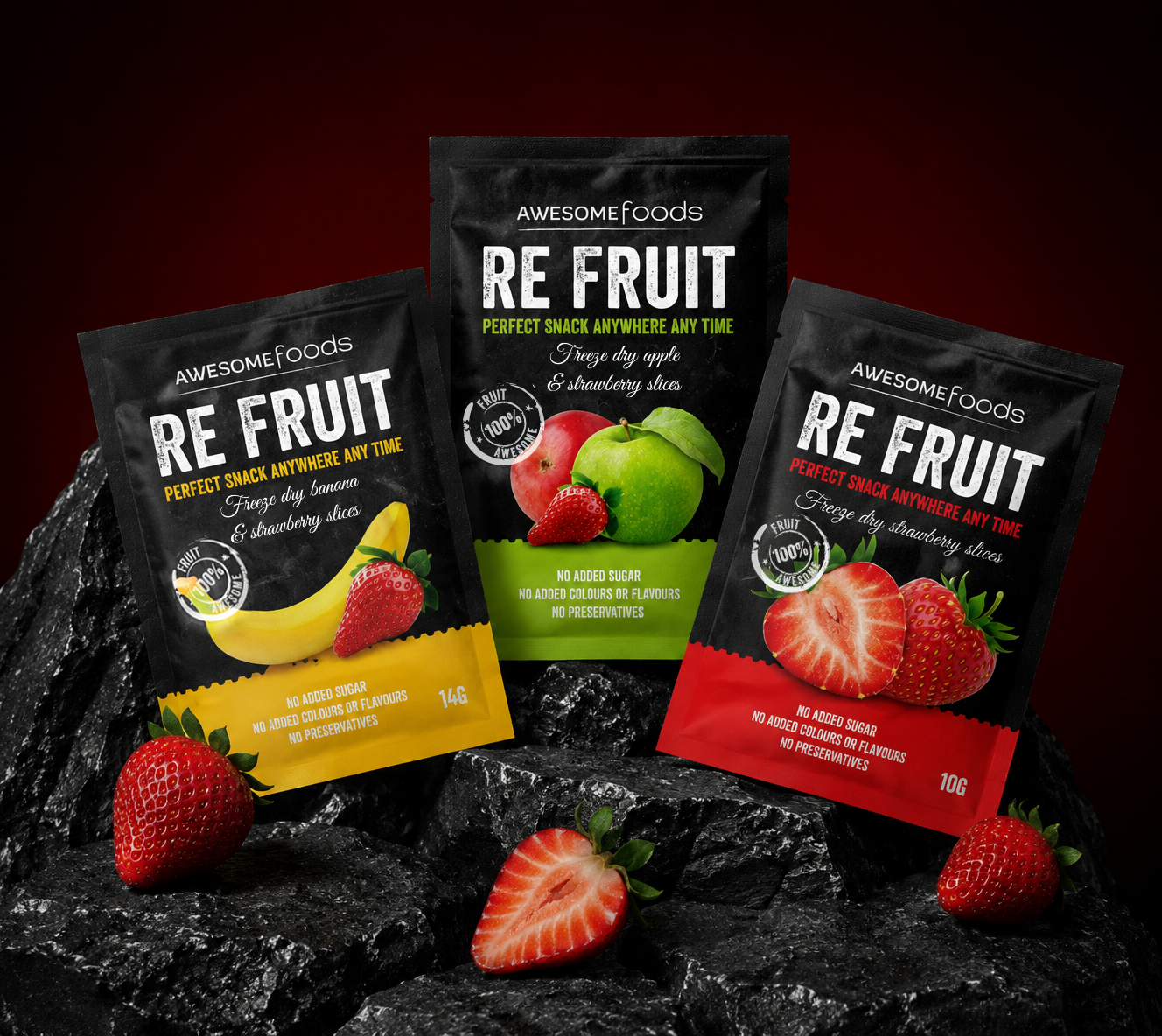
The visual identity relies heavily on "shelf-blocking" principles. By standardizing the top two-thirds of the packaging with a uniform matte-black textured background, the brand achieves unified prominence when multiple SKUs are grouped. This dominant dark block commands attention from a distance, while the localized, bright flavor bands (Green, Yellow, Red) provide an intuitive roadmap for browsing customers, significantly reducing consumer search time and driving conversion rates.
ENGINEERED FOR GROWTH
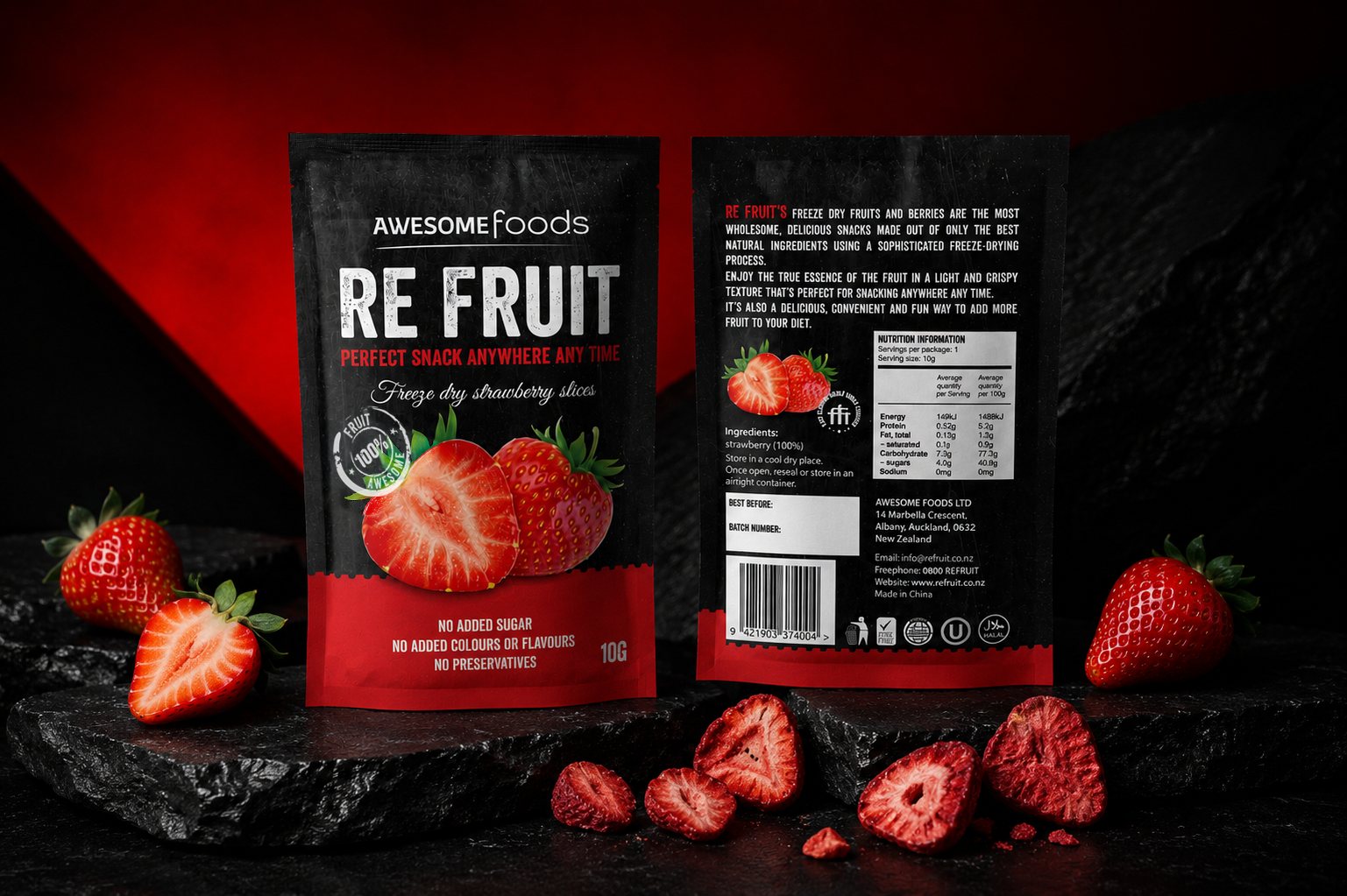
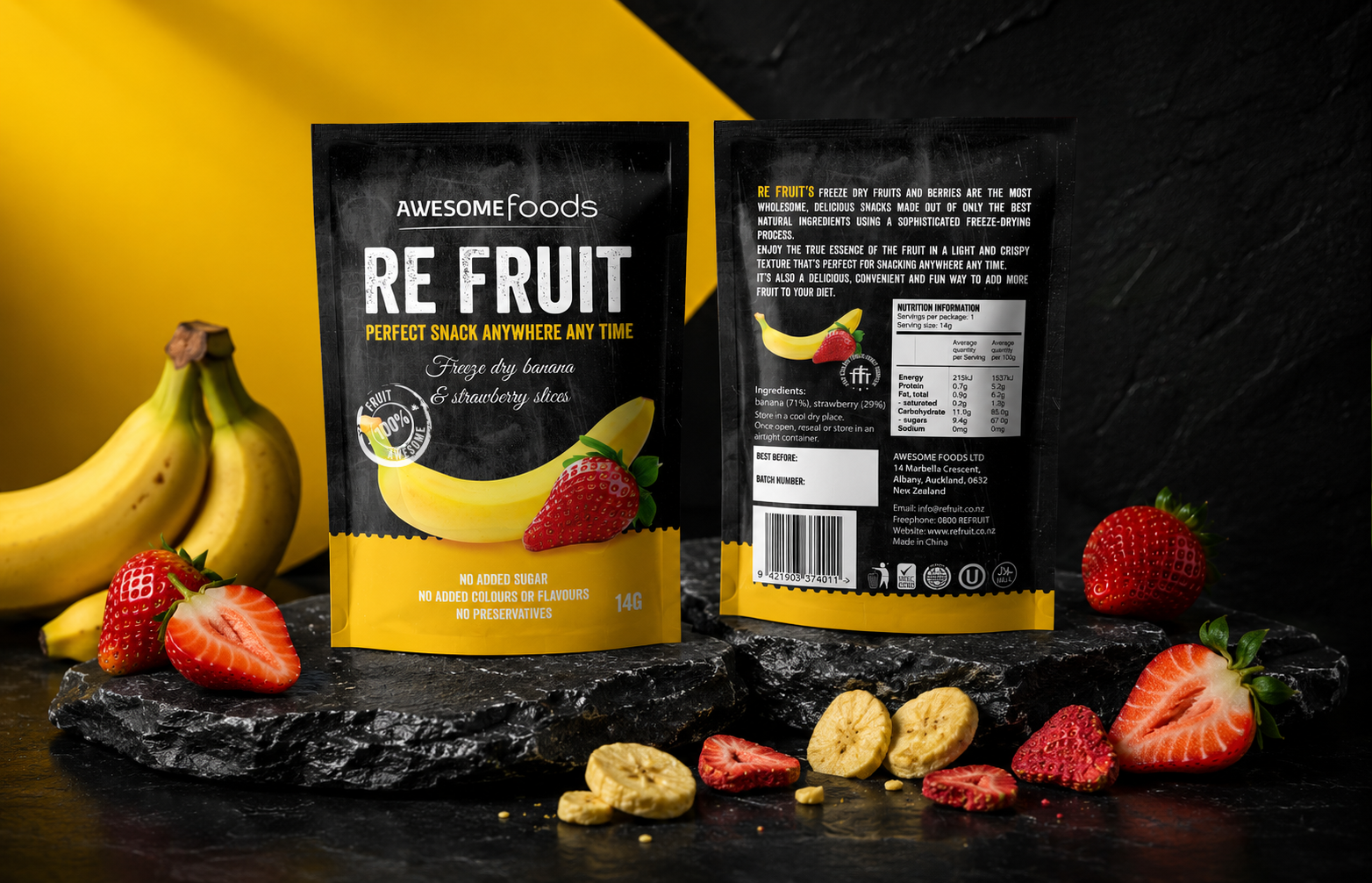
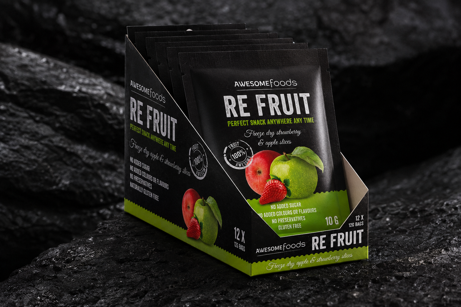
Commercial scalability was baked into the design DNA from day one. The packaging architecture relies on a strict asset grid where product photography, clean-label trust icons, and ingredient weight callouts occupy fixed semantic positions. This strict layout minimizes future design overhead, allowing the brand to launch line extensions seamlessly. Commercial readiness is fully realized in the custom master carton design (Shelf-Ready Packaging). The carton mirrors the exact graphic layout of the pouches, serving as a self-contained point-of-sale display that reinforces the brand's premium narrative and guarantees consistent visual presentation across all retail environments.