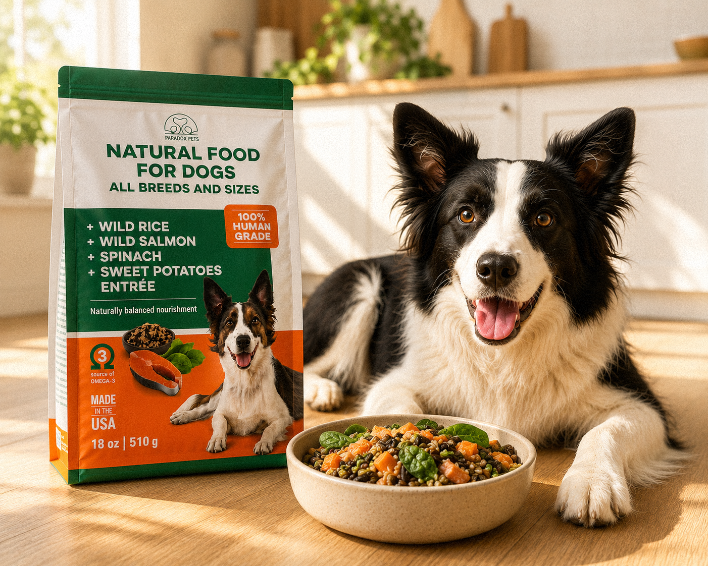
Premium Pet Food packaging for Paradox Foods
Strategy:
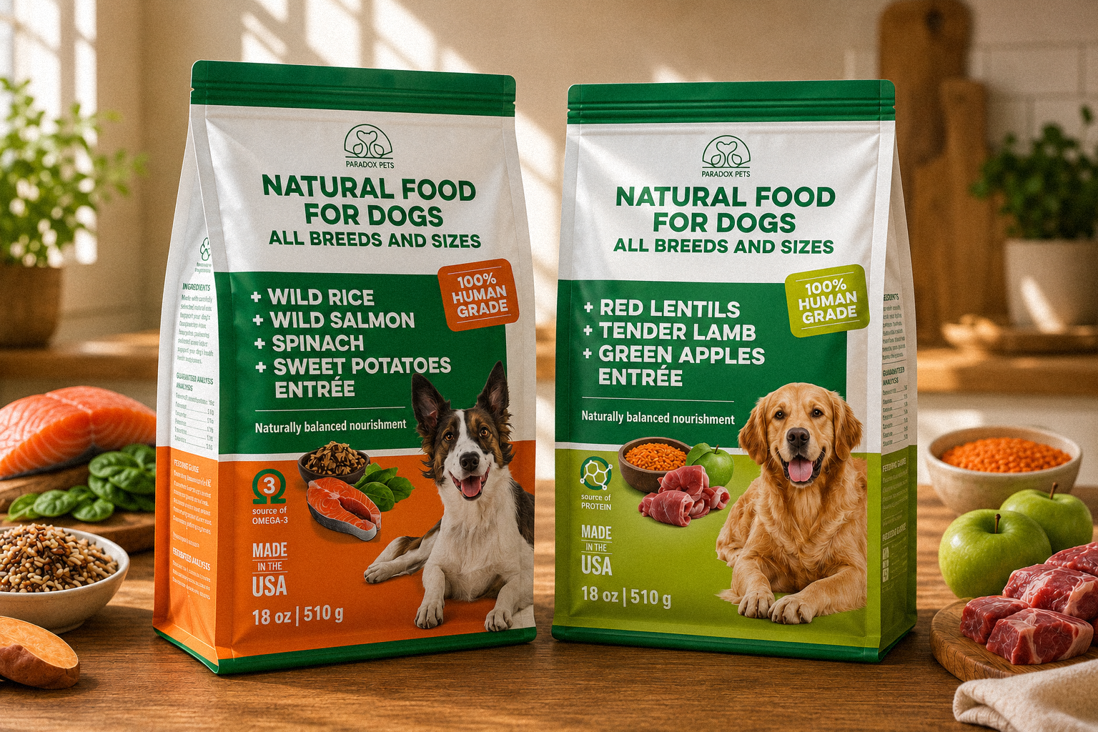
The premium pet food sector demands absolute transparency, as modern pet parents increasingly seek the same nutritional standards for their dogs as they do for themselves. Our strategy for Paradox Foods (→ Paradox Pets here) was to position their product line as a wholesome, trustworthy choice by leaning heavily into its "100% Human Grade" quality. We aimed to break away from both over-cluttered value brands and overly sterile, clinical packaging by establishing a fresh, premium, and ingredient-first brand identity that bridges the gap between human culinary standards and pet nutrition.
Execution:
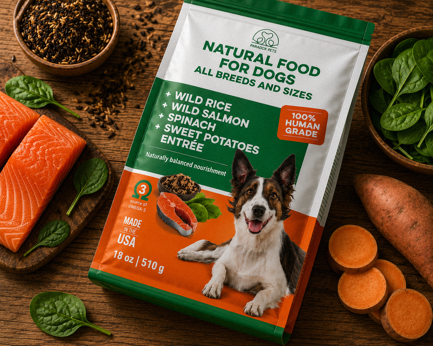
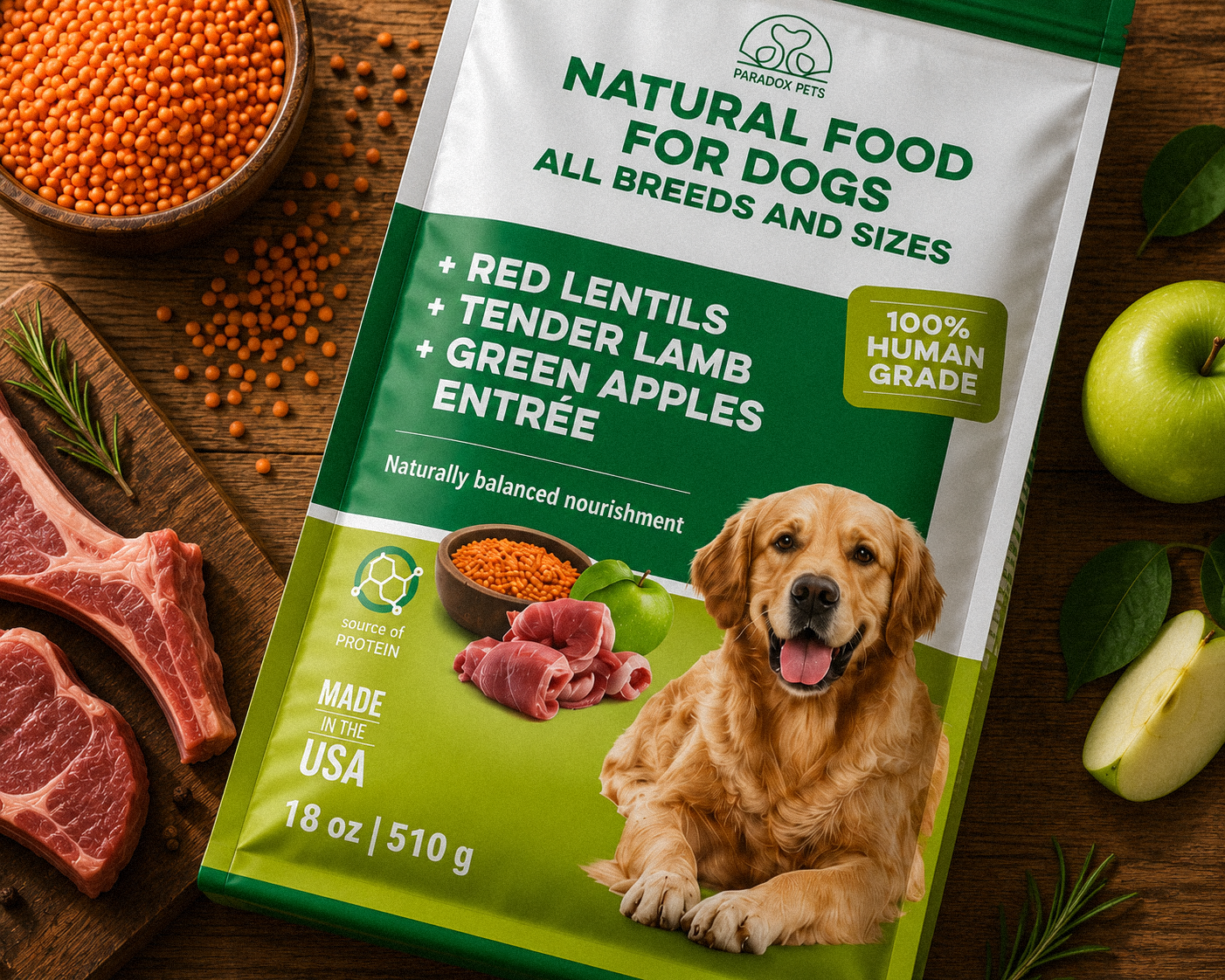
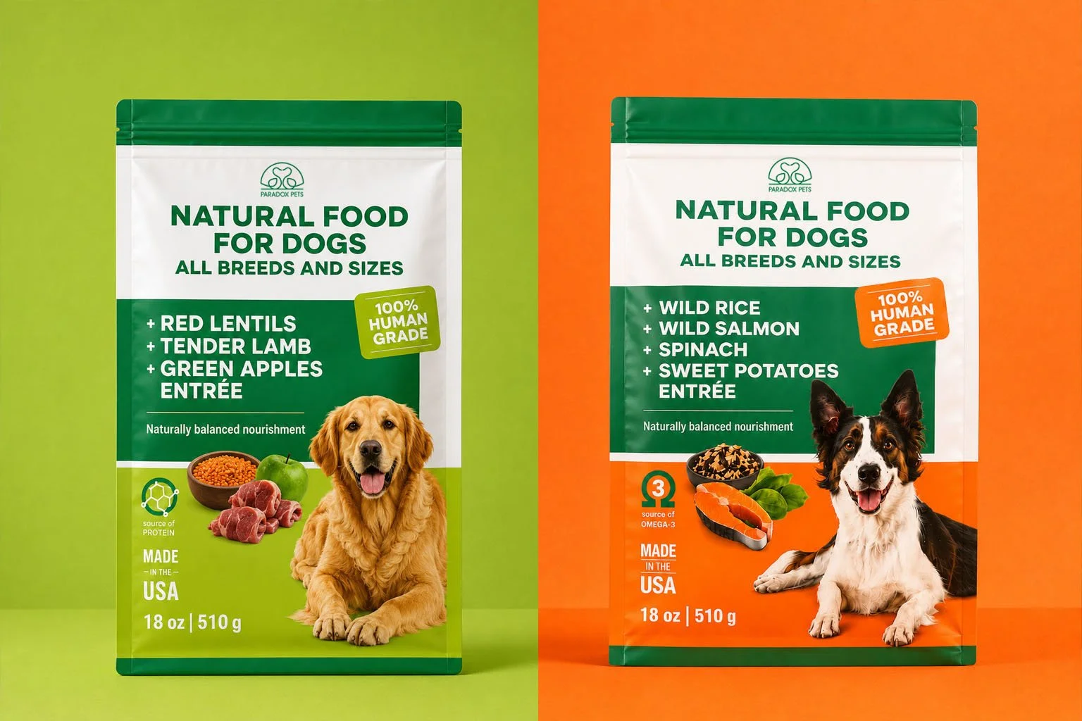
The visual architecture utilizes a structured color-blocking system, anchoring the design with a crisp white top section for immediate brand recognition and a deep forest green center that signals natural wellness. We established an intuitive color-coding system—vibrant lime green for the Lamb entrée and energetic orange for the Salmon entrée—to guarantee effortless variant navigation on busy retail shelves. Clean, upfront typography puts the whole-food ingredients at the center of the consumer's focus, while high-quality ingredient photography paired with expressive dog portraiture builds an instant emotional connection and visually validates the "human-grade" promise. This cohesive design language delivers exceptional shelf breakout while allowing the brand to scale effortlessly across future recipes.